We have now finished our practical project and I am presenting the evaluation of our portfolio on this blog. Using our individual skills sets to create our media coursework, we have successfully created not only an authentic action movie teaser trailer, but three realistic and professional looking movie posters and a movie magazine front cover, all featuring our fictional action movie ‘Precognition‘.
We have achieved this by looking at many of the conventions used in action movies of the past; from modern action epics to 80‘s blockbusters. We looked at many of the different conventions this genre of film follows, and the different ways in which we could create a new and interesting idea for an action film that would attract an action audience. From the beginning of our project we researched into the different conventions films like these used when it came to characters, setting, story, effects and many other different elements of the action film. We used the research we found to mould our own action movie teaser trailer and the aspects of the genre we wanted to include, as well as the conventions we thought we needed to follow. As our film was based around precognitions and the idea of ;‘future sight‘; we found it was quite similar to films such as ‘Next’ with Nicolas Cage, The ‘Final Destination’ Series and
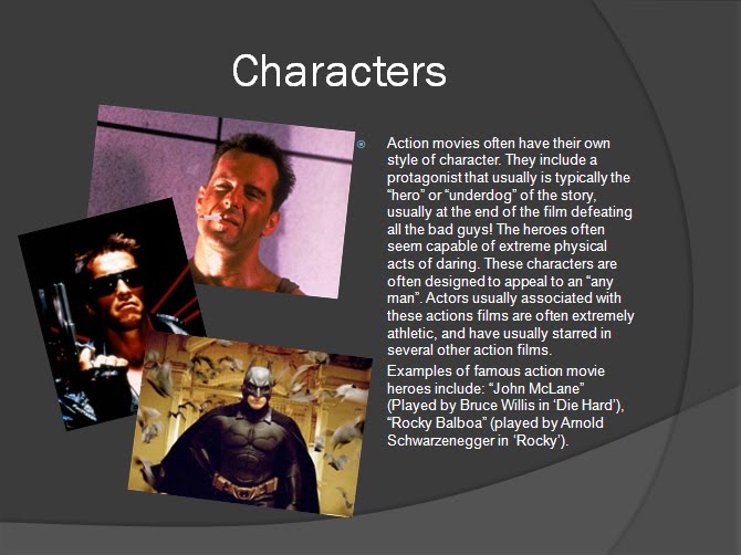
We found that there were many of these different films being produced with similar themes. As a group we researched the conventions films like these had specifically and found that there were plenty we needed to follow, but also plenty we wanted to challenge. To start with, we found that these films often had almost too much action in them; they focused on action scenes rather than the story themselves and although usually the idea of these films starts of as very clever and intriguing, they often all end in some kind of blurry, conventional plot ending that doesn’t make a lot of sense to the story and disappointed viewers; we found this out from actually having watched this type of film ourselves and reading reviews on the Internet. We felt that we needed a more unconventional story, something that was a little bit darker, a story where the protagonist is a lot darker as a character and not the immediate hero the audience might expect. We wanted a film that was similar to ‘The Dark Knight’, featuring a protagonist (in this case Batman/Bruce Wayne, played by Christian Bale) who was not the immediate hero and often struggles to do good, as well as a character that defiantly is not the protagonist (The Joker, played by Heath Ledger) but is someone that the audience can connect with and enjoy watching, even though he is traditionally the villain of the story. We decided to create a protagonist that didn’t follow the typical action movie conventions and was a different type of protagonist that is not immediately seen by the audience as the “hero”.
We also felt that we needed to look some of the conventional settings that action films used. We found that most action films used city settings to base their story around. Looking at films like ‘Die Hard’, ‘Terminator’ and again ‘The Dark Knight, all of these films were successful in using a city location for their plot and we felt that this was a convention that we wanted to follow. We decided that a seedy city setting would be perfect for our teaser trailer and eventually we found a great local location that we could use. We decided that even though some actions films work well in other settings, such as in jungle or country locations, our film would work perfectly in the city. The location we eventually chose was also a very dark and seedy place at night, we wanted to replicate the kind of setting we saw in other action films. We felt that a dark (night time) and empty location surrounded by large buildings would be an eerie and interesting setting for our teaser trailer; somewhere that would attract and intrigue the audience.
When it came to the Posters, as a group we looked at several example posters from films in the action genre. In our planning process, we decided that we wanted a series of three posters that were similar in theme, and could be easily recognisable; we decided that we needed some kind of house style/font to use, and created a recognisable font for the movie title and used similar fonts for the credits on the poster that almost every other movie poster has. We took these conventions from other movie posters we saw; they usually had the same theme and often looked very similar in house style. They all had similar layouts and we felt that in our project we needed to create posters that had their own house style, as well as being similar in layout; we used some of the ideas from the posters for ‘The Dark Knight‘ in which they have a series of similar styled posters that show different characters from behind. Although we used these conventions, we also challenged the conventions of the way in which images were used in the posters. We decided to use ‘arty’ filters and different lighting to create more mysterious images that would possibly attract a new type of audience. We wanted again, very dark and ‘seedy’ looking images. We found that this worked effectively and looked very professional.
We used exactly the same process whilst creating our movie magazine cover. We felt that we needed to follow the conventions other magazines such as ‘Film Magazine’ and ‘Empire’ used. We used a large image centered on the cover just like these magazines use when featuring a certain film. We also used the same house style/font we used for the posters so that people would recognise that it was the same film. We didn’t want to challenge any of these conventions for the movie magazine as we found that they worked well with what we were trying to do (if it isn’t broken, don’t fix it!).
Our movie ‘package’ worked well, and we felt as a group that we made it very clear that they were all from the same film (Precognition). We did this by taking the still images we needed for the posters and magazine cover at the same time we filmed for our teaser trailer. That way, they would all look similar, having the same setting, character and theme. As stated before when talking about the conventions of these types of movie packages, we wanted to use a consistent house style so that every part of the package would be easily recognisable as the same film, precognition. After designing an authentic looking movie title with a house font, we used it in each part of our package to reinforce the idea that it was all from the same film; using the same title in all of our posters and our movie magazine, as well as using it at the end of our teaser trailer. We decided that image of our Protagonist with a gun in his hand would be great to use as a theme for our posters and magazine cover. As this features at the end of our trailer (our protagonist gets a gun out), we felt that it would be a consistent and interesting image to use; changing the image only slightly in style each time. We also wanted to use dark colours and images to represent our film in the same way. The combination of using these similar and consistent images, house styles, fonts and colours meant that our main product (teaser trailer) went well with our ancillary texts (posters/magazine cover) and worked as an effective combination. I think that people would easily recognise all of the products as being part of the same package.
To make our products available to a wide audience, we decided that ‘You tube’ would be a great way of sharing our teaser trailer everybody that wanted to view it, and not only our examiners and teachers. We felt that this would no only allow people to view our work, but give us feedback on the product itself via comments and views. I think that any feedback from people you don’t know is good, even if it isn’t the positive feedback you may have wanted. We have a couple of very positive comments on our trailer already that praise our work, but also give us some constructive criticism. This includes a comment about shooting at night; if we were ever to do it again, we have been told that better lighting would be a good idea as the quality of the product is compromised in the dark. Apart from using you tube, ‘Blogger’ has been the key platform in presenting my coursework. Using this blogging tool, I have been able to effectively present the practical work as well as this evaluation. It is an effective form of Internet posting that has allowed people to follow my work, and comment on the work I have put on gradually throughout the term.
Creating this practical portfolio would have been impossible without the used of media technologies to help us construct our work. First off, the use of the Internet was key in not only our media research, but also in presenting the finished work itself. We used this tool a lot when researching action movies and their conventions; it helped us to shape our product and start to plan our teaser trailer and posters. Without the Internet I think it would have been a lot harder and a lot more time consuming to create a project like we did.
We researched into different films, including using YouTube to watch several action movie trailers, accessing movie posters from IMDb and looking at the covers of movie magazines on their websites. I obviously used the Internet for one the the key presentation elements of my coursework this year as well. i used Blogger to present and post my coursework online as well as providing links to our own movie teaser trailer itself. It was very easy to use and a vital tool when it came to writing about our portfolio. On top of this, we used the site YouTube to present the actual trailer itself. It is a free video sharing website which allowed us to easily upload and present our 'Precognition' trailer to everybody who visited the site. This also allowed us to link the video to our blogs.
Production: Final Portfolio
Final Portfolio Practical Work:
After presenting all of our practical portfolio in design stages, I thought that it might be a good idea to present all of the final versions of our work in one blog post. Below is the YouTube link to our final teaser trailer, images of our 3 movie posters, and movie magazine front cover, featuring our action film.
Our Trailer: http://www.youtube.com/watch?v=0iIOeT5liHY
Movie Posters 1,2 and 3:


Production: Movie Magazine Cover
Introduction:
Creating a movie magazine cover, featuring our film (precognition) was another big part of our ancillary task. We wanted to be able to create an authentic looking movie magazine cover, with an image from our film precognition, that would be recognisable. During planning, we decided to do this by using the Adobe Photoshop software to create the cover, using real movie magazines such as 'Film Magazine' and 'Empire Magazine'. This would allow us to create a realistic looking movie magazine cover that would be believable to somebody who viewed it.
Practice Movie Magazine Cover 1:
Here is the first practice poster we created (below):
.jpg)
This is our first attempt at creating a movie magazine cover, we have not imported a cover image of our own just yet, but we are using an image we found as a background image for the moment. We have called the magazine 'Just Film' and have used a large stylised title at the top of the page. This is because we found that most movie magazines had their own recognisable title logo and it often becomes one of the main images on the cover page. We obviously added the title for our film 'Precognition' using our own recognisable logo for the film, It is very well displayed so any potential readers can see that it features our film as an 'exclusive'.
We have obviously created fake article headings and bluffs to use for the magazine, as well as price and date etc. We have managed to follow our plans and have mainly focused on the layout of the cover at the moment.
Practice Movie Magazine Cover 2:
We have now been working the second version of of movie magazine cover, but it is still not completely finished.
.jpg)
Now, we have edited the poster slightly more. We have added an image for the movie that we have used on one of the posters; this was a deliberate decision as we could edit the image slightly to make it different for the magazine cover but at the same time, people could recognise the image from the posters for the film. We have edited the image slightly and made darkened the colours; it is now a darker orange/red than it was before. As well as this, we deliberately overlapped the image of the protagonist with the magazine title (this is not yet finished as it doesn't line up properly). This was also very deliberate, as we found that most movie magazines do this to give the cover article a sense of standing out. Some obvious other changes we have made have been, including the red letter 'C', changing the fonts for the article titles and bluffs as well as the font colours. These were all deliberate design changes to make the cover stand out more and make it easier to read.
Practice Movie Magazine Cover 3:
.jpg)
Now, we have been focusing on making the magazine look on whole, more realistic and believable. We have changed the layout slightly, adding a much more interesting 'typing' font that we felt was very effective and stands out. We have also done some styling, and have made the image black and white, we don't know whether or not to keep this yet, but will; decided when it comes to making the final poster.
Final Movie Poster:

This is the final movie poster (above). We have changed the image back to colour, whilst making it slightly darker and slightly more blurred. This is more attractive to viewers, and also more intriguing. everything else we have kept pretty much the same from the previous design stage. We felt that we have now included everything that is needed to make an authentic looking movie magazine cover, and have f ocused on using our film as the feature.
Production: Movie Posters
Introduction:
Creating the movie posters was a big part of our practical ancillary task. We wanted, as a group to create very authentic and professional looking movie posters to go with our trailer for Precognition. These posters needed to follow the conventions we researched and the plans we made.
Size and Format:
First off, we decided in our planning that we were going to use Adobe's Photoshop software, this is because we have experience in using this photo editing software; using it to create our AS level media portfolio. We first had to design a base that was A4 size, so that we could create something that could be scaled up or down in size when it came to printing. We found that A4 was the perfect size for our posters, as it was the right shape and size that we wanted.
Significant Movie Posters:
As a group during our research and planning, we have looked at many different movie posters and have some significant posters that we have taken ideas and conventions that we would like to apply to our own posters when creating them. These posters have been included below:


All of the above posters have design aspects that we want to include in our movie posters. Here are some of the things have taken into account from these posters:
Both posters for 'The Dark Knight' have city based backgrounds with large buildings in the background, we think that this would be perfect for our own posters.
They all have their own movie title logo's. We have already created our own logo, and want to apply it like the posters above; either at the top of the poster or at the bottom.
We also might include song kind of tag line, like the one at the top of the 'Die Hard' poster.
The second and third posters have credits shown at the bottom of the posters, both in the same style font. This is something we are keen on including.
In the second 'Dark Knight' poster, they include the names of actors/actresses that are starring in the film; their last names are much bigger than their first names. We felt that this was an effective way of showing the stars of the film and want to include this in our posters.
Each poster features one of the main protagonists in the centre, often wielding some kind of weapon. This is something we have thought about including for a while, and feel this would defiantly make an effective movie poster.
The first 'Dark Knight' poster features the back of the main antagonist of the story. We liked this back facing image and would like to include it in one or more of our posters.
Poster 1: Initial Version
Here is the first of our three movie posters we are going to create (below), It obviously isn't finished and eventually we will make a final version of this poster.
.jpg)
Text, Fonts and Layout:
This poster (above) shows the image and layout we want to use when it comes to creating our final movie posters. At the moment, we are just playing around on Photoshop with different images and texts to see what looks good and what works with our trailer. Obviously, using the recognisable 'Precognition' logo was a priority for us, we knew that we would need this in our poster to make a consistent project. We found that most movie posters placed their movie title along the bottom of poster itself, whilst leaving enough space for credits. We also found that movie posters often had their cast along the top of the poster; they featured actors that would attract audiences to watch the film. Obviously we had no famous actors to include in our film, so we just used the names of people who featured in our trailer or could feature in our fictional film.
The most important thing about this first poster edit is the image we used. We felt that this was one of our best still images, and defiantly wanted to use it as one of our movie posters.
At the moment we are looking to download fonts for our posters. We have noticed that most movie posters use similar fonts for their credits. Taking this into account, we have done some research and we are looking to download a font called 'BeeTwo' or a font called 'Steeltongs'; this is so that we can easily type up some fictional film credits at the bottom of the poster, including logos and trademarks.
Image:
The Image itself has not actually been edited that much. We used a high resolution stills camera to take this image while filming. It was taken under an orange tinted street light, whilst no flash was used; this made for a very effective and interesting image of the main protagonist holding a gun. We also followed through with our planning, having an image of a character with his back to the camera/audience. This makes for a more mysterious and interesting poster that would intrigue viewers. We added a filter, available to us using the Photoshop software, called 'Dark Strokes'. We felt this made the image slightly more edgy and arty looking. We intend to keep this image for the final edit of this poster.
Movie Poster 2: Initial Version
.jpg)
Image:
Whilst using the same kind of layout as our first poster, we have decided to use this image. The image shows a close up of our protagonists hand holding a gun; we used the same kind of lighting to take this still image as the first image showing a similar shot like this. We like the image itself and we have used a filter to give the poster a kind of edgy look.
Text, Fonts and Layout:
As a group, we like the image itself, but we are thinking about changing the colours slightly, as well as the filter we used. Obviously we are also going to change the text and layout of the text when we get round to finishing the first poster, we want these posters to have pretty much the same layout and fonts.
Movie Poster 3: Initial Version
.jpg)
.jpg)
Image:
With both of these initial 'pratice' versions of our third poster, we used a slightly different image than that of the first two still photos for the poster. Whilst still using the same theme of having our protagonist holding a gun, whilst only being visible from behind; we have changed the lighting and the angle of this shot. We used a clear shot using the camera's flash, whilst shooting this from a low angle for effect. In this image we included a street light near a wall for a visible lighting effect as well. We took this low angle image by having our protagonist stand on the top of a tall wall, that way me managed to get a shot of the tall buildings above to the right. We decided not to use any filter effects for this image as we found it effective as it was, although we did blacken the top left edge for an 'arty' effect.
Text, Fonts and Layout:
Obviously we haven't changed much on this poster in terms of text, fonts and layout, compared to the previous posters. We have added some credits to the first version, but they are NOT ours; we just wanted to see what they would look like when applied to the posters themselves. We also changed the title logo slightly, by giving it a red letter 'C', we thought we could use this in some way to link to our story. We also added a tag line to the second version of this poster, we felt that it could be interesting and attractive to audiences to give a small tag line from our film. If it were real, it could give clues about the film to somebody who doesn't know a lot about it; it could attract some potential viewers.
Poster 1: Final Version
We have taken note of things we wanted to add/change from the initial mock of of this first poster. Now we have created the final version of our first 'Precognition' movie poster. (Below)

The image we have used is basically the same as the initial version of this poster. As a group we decided to change the font used for the cast at the top of the poster; we found it was effective making the last names slightly bigger than the first. We also downloaded a font called 'steeltongs' to use for the credits at the bottom of the poster. This allowed us to create realistic looking movie credits for the poster that included logos and trademarks. We also added 'coming soon' to the bottom of the poster, we decided not to include a date as usually when teaser trailers/posters are released they don't actually know when the films release will be.
We feel that this poster is very authentic and professional looking; this is the final version of our first poster and has a great finish.
Template
We have decided that using a template would be the easiest way to create a consistent series of movie posters. We need to create two more movie posters that look and feel similar to the first. If we remove the background image from the first poster, we can easily add and change a new image to create a second poster; whilst still leaving behind the title, credits and cast text. This would be a perfect was of creating a series of posters. We could also slightly change some of the text positioning if we need to, this would give each poster a fresh 'look'.
We have now created the movie poster template and i have included a JPEG of this below:

Obviously now we have included finished credits, cast and titles to use for all three movie posters. We can change the colours, and position of any of the text used in the template above easily, using Photoshop.
This will now allow us to create focus on creating two more similar posters that can work with the first as a series of posters. Below are the final versions of the second and third posters:
Movie Poster 2: Final Version

This is the final version of our second poster. We have kept the same image of the gun in the hand of our protagonist, but for the final version we have changed the colour levels, increasing the red in the poster (basically darkening the existing natural orange tint). We found this looked more effective and we wanted this poster to have more of a different look than the first poster, which to start with, it didn't. We have used almost the exact same text template as the first poster, although we changed the colour of the cast list at the top, they are now all in white rather than fading from white to black. This was simply because this allowed us to highlight the cast at the top of the poster. We feel that this poster is now authentic enough to be one of our final posters. It fits in well with the other poster and would work well in this series of three posters. The colours also correspond with movie magazine poster.
Movie Poster 3: Final Version

Again, this is the final version of our third movie poster. It isn't much different from the previous 'inital third poster'. The image is pretty much exactly the same as it was before, but it has been added to the text template we created using the first final poster. We have added the tag line we created, and also changed the colour of the letter 'C' again. We found this to be a fresh change to the three posters in the series, whilst it is still very recognisable.
Conclusion:
We are pleased with all three of these final posters. We have achieved all of the things we set out to do when creating this part of our project. We have successfully created a series of three posters that could be easily recognised as being associated with the same film. The only thing I would like to have done differently, is to be able to create more posters with different characters and settings for our film!
Production: Action Movie Teaser Trailer
Introduction:
When producing our action movie teaser trailer, as a group, we have taken all of our research and planning into account. We used our extensive planning to save time and effort when it came to the filming and editing of our teaser trailer, creating something that we feel has really worked as a successful project.
Our Trailer: http://www.youtube.com/watch?v=0iIOeT5liHY
Above is the link to our final, fully edited movie teaser trailer for our action film 'Precognition'. We have worked hard planning and creating the trailer and i feel as a group, we have created something that is authentic and looks proffesional. We acheived creating this trailer by using our knowledge of films aswell as our in depth research about teaser trailers and action films.
Examples:
We had some ideas about what we wanted the teaser trailer to turn our like. We looked at many different REAL movie teaser trailers and found that one of the trailers for the Batman film 'The Dark Knight' had the same look and feel we wanted for our teaser trailer. I have presented a link to this trailer below:
Dark Knight Teaser Trailer : http://www.youtube.com/watch?v=Weo0MEGU96s
Filming:
Filming our teaser trailer was easy, we had a location we wanted to use, props and equipment as well as a friend we asked to play the main protagonist in the teaser trailer. This was all thanks to some very focused planning. We chose a night to film, and went to our location with all of the things we needed. We decided there and then what exactly we wanted to include the character doing, planning the different shots we wanted to include. This meant walking around with the camera and tripod and practicing different angles and shots, which took longer than we first anticipated. We first focused on the filming itself and then shot around 50 stills afterwards so that we had a good selection for our posters and magazine cover.
Shots and Ideas:
We wanted the teaser trailer to follow our planning. To start, we wanted a long panning shot of the main male protagonist (played by Ben Dowling), walking down the main location with large building surrounding him. We wanted this shot to create a mystique around the character, while the voice over was edited over the top of this shot (and throughout the trailer). We chose the character to be wearing a suit jacket, and to be smoking; we just found it to be something we wanted to include. We then wanted the character to be filmed walking to his car and being stuck up on, and being attacked by two men (played by myself and Charlie). He would then be attacked and shot. We decided to use some interesting shots here, especially the shot in which the camera almost represents the the point of view from the male protagonist; it is basically a 1st person shot right before the character is killed and the screen goes blank.
Problems We Had During Filming:
During the filming of our trailer, we did encounter several problems that we didnt plan for. At first we were pulled over by the police because we looked suspicious (4 boys driving around in the middle of the night, in the middle of town). We also came into problems on location, when we were stopped from filming by security on site, but were allowed to continue a little while later. As well as this we had a few outakes in which filming went wrong, I have included the funniest outake below: (This is when sam, acidently gets us in the shot accidently, turns and then falls over a post behind him).
Editing:
Sam focused on most of the editing process for our trailer. He was very experienced in editing and had the software we needed at home. We brought together all of our production ideas and helped him when it came to editing; decidign what we wanted to included, which shots, scenes and images we wanted. We used the Sony Vegas editing software to effectivly create the teaser trailer, using this to also add effects such as gun shot sounds aswell as lighting.
Conclusion:
Pre-Production: Planning
Introduction:
Before we even start on our production itself, we have been doing some extensive planning that will hopefully help us save time and effort when it comes to actually producing our portfolio of work. We felt as a group that we need to work on 4 different areas of planning; we first need to create an idea for our movie; some kind of vague plot/story line that we could use for our trailer, this would also have to include key characters and themes . We also need to find a suitable location/locations to shoot our teaser trailer locally if possible. As well as this, we need to think about the equipment we would need for our shoot (camera, props etc.), and finally the way in which we would edit our filming, posters and magazine cover (the software we would use, images and scenes we want and format). I will present the planning process below:
Initial Trailer Planning and Plot Ideas:
We have first decided to focus on the story/plot of the action movie. After researching the genre, we have already had a few ideas on what the trailer should have in general, this includes:
We have now thought about some more detailed plot and teaser trailer ideas. We have decided that the teaser trailer needs to be around 2 minutes long, but no longer; this is because we felt that if the trailer was any longer than this, it would no longer be a teaser trailer, but a full blown movie trailer. We have been thinking about the construction of the trailer itself, deciding that we want to have some kind of situation in which the protagonist cannot escape from, but at the end of the trailer, his future has been changed by his precognition. In other words, at some point in the trailer, the protagonist will have a vision of the future and the ending of the trailer will be changed by this vision.
Movie Title:
In this process we have also made a decision on the title of the action movie itself; since the protagonist will be having ‘precognitions’, we have decided on the title “Precognition”. We felt that this has sums up the film in one word, and is an effective and interesting title that would draw in an audience.

Voice Over and Script:
We knew that we would want a voice over to add to the teaser trailer from the beginning of our planning, we have decided that a voice over narration from the male protagonist would be a lot more effective than dialogue itself. We felt that it would help to give the audience some clues about the character and possibly help the character relate or become more intimate with the audience. Planning script for this voice over has become one of priorities for the trailer. After discussing the script, here is a list of what we thought it would need to include:
We have now written the script for the protagonist’s voice over narration, and will later cast somebody to actually record the voice over itself. We felt we needed to get this done early on in the planning of the trailer so that we would know how long we wanted the filming itself to be; we would be able to judge how much filming and editing we need to do when the time comes to do it.
Trailer Setting:
We have now started to plan and find a suitable setting for our trailer. We have decided that the trailer needs to be set locally (in and around the Bristol area), this is for superficial reasons; we can only travel so far with equipment and props!
We have been thinking about a city setting for our trailer, we thought that this would be a more interesting setting for an action trailer and would also follow some of the conventions set by other action movies; an action movie set in the country would just not be realistic or interesting! We felt that a city setting would make a much more seedy and believable setting for our action teaser trailer. We also felt that a night time setting would be important, not only to give the trailer a seedy, dark feeling that we wanted, but also because it would be easier to film as night time, with less filming distractions.
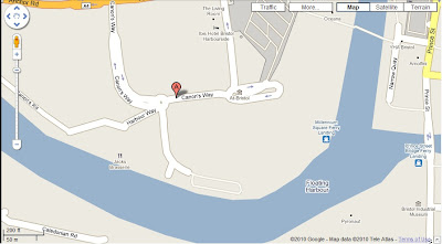
We have now looked at some possible locations for our trailer in and around Bristol City Centre, we have used Google maps to present these in our blog, you can click on any of these images to view them in more detail, or just look them up on google maps yourself! They have each been flagged on the map:
http://maps.google.co.uk/
Location 1: Prince Street/The Grove, Bristol.


Location 2: Cannon's Way, Bristol.


We have also been thinking about the equipment we would need for shooting our action trailer. We decided to start with, we have made a decision on which type of camera we should use for filming; we had the choice between a lower resolution cameras with easy access, or a higher resolution HD video camera that would be harder to get our hands on. We decided that it would be worth while to use the HD camera, not only for its higher resolution video, but the high resolution still shots that it is able to produce as well (obviously we would need a decent selection of still images to use for the posters and magazine cover as well). We also decided that we would do most of the video shots using a tripod as this would give us much more consistent, steady shots that would look more professional. Obviously we also needed to make sure we had sufficient film or memory on the camera to shoot the trailer and extra batteries!


Conclusion:
In planning this project thoroughly, we have been able to make essential decisions and obviously plans we will need when creating our project. All of this planning has pointed us in the direction we want to go, now all we need to do is follow it!
Before we even start on our production itself, we have been doing some extensive planning that will hopefully help us save time and effort when it comes to actually producing our portfolio of work. We felt as a group that we need to work on 4 different areas of planning; we first need to create an idea for our movie; some kind of vague plot/story line that we could use for our trailer, this would also have to include key characters and themes . We also need to find a suitable location/locations to shoot our teaser trailer locally if possible. As well as this, we need to think about the equipment we would need for our shoot (camera, props etc.), and finally the way in which we would edit our filming, posters and magazine cover (the software we would use, images and scenes we want and format). I will present the planning process below:
Initial Trailer Planning and Plot Ideas:
We have first decided to focus on the story/plot of the action movie. After researching the genre, we have already had a few ideas on what the trailer should have in general, this includes:
- Action Scenes (fighting, guns etc).
- An intriguing plot line that would attract our target audience.
- A male protagonist.
- Some kind of antagonist to the story.
- An interesting setting.
We have now thought about some more detailed plot and teaser trailer ideas. We have decided that the teaser trailer needs to be around 2 minutes long, but no longer; this is because we felt that if the trailer was any longer than this, it would no longer be a teaser trailer, but a full blown movie trailer. We have been thinking about the construction of the trailer itself, deciding that we want to have some kind of situation in which the protagonist cannot escape from, but at the end of the trailer, his future has been changed by his precognition. In other words, at some point in the trailer, the protagonist will have a vision of the future and the ending of the trailer will be changed by this vision.
Movie Title:
In this process we have also made a decision on the title of the action movie itself; since the protagonist will be having ‘precognitions’, we have decided on the title “Precognition”. We felt that this has sums up the film in one word, and is an effective and interesting title that would draw in an audience.

Voice Over and Script:
We knew that we would want a voice over to add to the teaser trailer from the beginning of our planning, we have decided that a voice over narration from the male protagonist would be a lot more effective than dialogue itself. We felt that it would help to give the audience some clues about the character and possibly help the character relate or become more intimate with the audience. Planning script for this voice over has become one of priorities for the trailer. After discussing the script, here is a list of what we thought it would need to include:
- Some kind of introduction to the protagonist.
- Information on his power and what he believes.
- A deep, interesting and drawing voice for the audience.
We have now written the script for the protagonist’s voice over narration, and will later cast somebody to actually record the voice over itself. We felt we needed to get this done early on in the planning of the trailer so that we would know how long we wanted the filming itself to be; we would be able to judge how much filming and editing we need to do when the time comes to do it.
Trailer Setting:
We have now started to plan and find a suitable setting for our trailer. We have decided that the trailer needs to be set locally (in and around the Bristol area), this is for superficial reasons; we can only travel so far with equipment and props!
We have been thinking about a city setting for our trailer, we thought that this would be a more interesting setting for an action trailer and would also follow some of the conventions set by other action movies; an action movie set in the country would just not be realistic or interesting! We felt that a city setting would make a much more seedy and believable setting for our action teaser trailer. We also felt that a night time setting would be important, not only to give the trailer a seedy, dark feeling that we wanted, but also because it would be easier to film as night time, with less filming distractions.
We have now looked at some possible locations for our trailer in and around Bristol City Centre, we have used Google maps to present these in our blog, you can click on any of these images to view them in more detail, or just look them up on google maps yourself! They have each been flagged on the map:
http://maps.google.co.uk/
Location 1: Prince Street/The Grove, Bristol.


We have chosen Prince Street as one of the possible locations of our teaser trailer. It is a city setting, surrounded by large work buildings, set right by the river. It is a quite place at night, and lit well with street lights. This could be a good place for our trailer to be set, although there are a few problems with it; it may still have some people at night, it is not an amazingly attractive setting (there is nothing special about it) and it is often full of traffic. This could be a problem when going to film there, especially with props like fake guns!
Here are some more images of the same location, taken from google maps again. This time, we have used the street view in google maps to show you the location up close and from street level.
Here are some more images of the same location, taken from google maps again. This time, we have used the street view in google maps to show you the location up close and from street level.


Location 2: Cannon's Way, Bristol.


We have also chosen the canons way area because of its interesting city setting. It has plenty of large work and living buildings surrounding, and also has a large Lloyd's Bank in the centre of the street. The buildings here are unusual and could be great for filming, including one very large rounded bank building. The streets are often quite empty here, but at night time, it is quite busy. It has a taxi bay where taxis wait for customers.
Again i have included images of the location from street view:


Location 3: Pipe Lane/ Temple Back, Bristol.


The last location we looked at (Pipe Lane/Temple Back) would also work well for our teaser trailer. It includes large government owned buildings set in a very isolated street. The buildings have a pathway in between them that can only be accessed by foot. Although this path is not very well lit, it would also be a great location as it is set right next to the city's main railway station Temple Mead's.
Again i have included the location in street view:


Location Choice:
We have decided to use our third location, Pipe Lane/ Temple Back, Bristol as our teaser trailer setting. We have found this to be the perfect location not only for our initial plot ideas, but also for filming. The area has a long path way that is spot lit the whole way down. It is surrounded by large government buildings that would be interesting on film, and can be shot from many different vantage points for effect. The area we have chosen is right next to the railway line and rail station, so we could possibly incorporate this into our trailer. The location is also extremely quiet, both in the day and at night; it would be a great location for our trailer.Filming Equipment and Props:
Filming Equipment:We have also been thinking about the equipment we would need for shooting our action trailer. We decided to start with, we have made a decision on which type of camera we should use for filming; we had the choice between a lower resolution cameras with easy access, or a higher resolution HD video camera that would be harder to get our hands on. We decided that it would be worth while to use the HD camera, not only for its higher resolution video, but the high resolution still shots that it is able to produce as well (obviously we would need a decent selection of still images to use for the posters and magazine cover as well). We also decided that we would do most of the video shots using a tripod as this would give us much more consistent, steady shots that would look more professional. Obviously we also needed to make sure we had sufficient film or memory on the camera to shoot the trailer and extra batteries!

This is the camera we are going to use for filming, it is the Fugifilm Finepix S2500 HD Camera. It shoots HD film and saves it onto an SD card. It also shoots incredible still shots in HD.

Props:
The props we needed would also make a difference to the finish quality of the trailer; if we used fake looking props, then the trailer would be a lot less believable and this could not really be edited later on. We decided that we would need prop guns for the teaser trailer, as we already had some idea that the action story would need guns (after all, what action movie doesn’t have guns?!?). We knew a friend that we could borrow several realistic looking BB guns as well as costumes that we may need for the trailer. Other than that, we decided that it would be easiest to keep props to a minimum.
Editing Software:
Thinking about the later stages in the trailer making process, we knew that we would need access to some decent editing software, not only to create the trailer, but to create the posters and magazine cover as well.
We had an easy choice when it came to the software we would need to help create the movie posters and the magazine cover; deciding to use Adobe’s Photoshop. This decision was made because of the ease of use of the software itself, it is easy to create something we needed; with the right still images of course! We also had extensive use of this software on the previous AS level course, creating a music magazine, so that we knew it would be perfect for creating our magazine cover.
It was much harder to choose editing software we could use when it came to editing the filming into our final trailer. We thought about using the Apple iMovie software that comes as standard on the Apple Macs, but this software is very basic and when creating a teaser trailer, we knew that we would probably need to at least add some basic effects that this software doesn’t have ( it isn’t the best software available!). We also had the choice of using a program called Sony Vegas; this software could help us edit the filming with more detail and precision, also making effects that we needed accessible to us. The only problem with using this software was that it wasn’t accessible in our sixth form, so we would have to do all of the editing at home. We have decided that this won’t be a problem, and have gone with the Sony software.
Poster and Movie Magazine Planning:
Although the trailer itself is a very important part of this media projects, we also felt that both the movie posters and the magazine cover would be just as important when it came to the project in general; without authentic looking versions of these, then the whole realism of the trailer may be at risk. We want to make the posters and magazine cover as detailed and highly finished as possible.
Poster:
We have been thinking about ideas for the posters we are going to create, deciding that a series of 3 similarly themed posters would be perfect for our project. This would be perfect for our group of three; we could each work on 1 poster separately, and work as a group to create the movie magazine cover. We felt that these posters need to be ‘edgy’ and dark. Action movie posters often focus on one character or group of characters that star in the action movie itself, we also felt that we need to follow this convention and have our main male protagonist as the focus of the posters. We have looked at many examples of posters in the research we did for this project, and have got a good idea in our heads of what we want the posters to look like, and represent. We also decided that these posters need a recognizable branded font for the ‘Precognition Title’, as well as the font used for the small credits shown on most, if not all movie posters. This needs to be very recognizable, and similarly placed and colored on each poster; we can then also use this text for the title clip for the teaser trailer itself. Here is a vague plan of what we want the posters to look like; I have used Microsoft Office Publisher to create a general outline:

Movie Magazine Cover:
Creating a movie magazine cover as a group should be easy, as last year we focused our project on creating a number of music magazine issues including 2 front covers. Movie and Music magazines have very similar ‘looks’ and can be easily recognized in shops. We feel we need to make our movie magazine cover look similar to other magazines currently available on the market. We have looked at a number of example movie magazines including ‘Film Magazine’ and ‘Empire Magazine’ and taken our own visual tips and styles from these to apply to our own magazine cover. Here is a vague plan of what we want the magazine cover to look like; I have used Microsoft office publisher to create a general outline:

Final Plot and Basic Story Board/Scene List:
Now we have finalised the plot as a group, and we have designed an outline of the trailer storyboard. We wanted something that was quite less action based, but still had elements of action embedded in it. We felt that we would keep the use of props to a minimum, but at the same time, when these props were used (mainly fake guns); they would at least be authentic looking replicas. We made a decision that our story needed some kind of action scene early on in the planning process, and finally now we have decided that this action sequence needed to be no longer than around 20 seconds to actually draw in the attention of the viewer. The trailer itself needed to be around 2 minutes in length (including the titles and credits etc). Here is the basic plan of the different scenes that we have now planned:
- Scene 1: The male protagonist is walking along the main pathway of our location whilst voice over plays. Different shots and angles can be used to give the scene interest.
- Scene 2: The male protagonist stops briefly, acting almost as if he has some kind of head ache. (This is where we will cut back to in scene 5)
- Scene 3: The male carries on walking until he reaches his car. Going to get in, he is attacked by two men (their identities are hidden in some way).
- Scene 4: The men beat the protagonist to the ground, and shoot him (the protagonist is killed). At this point the screen goes blank (white or black?).
- Scene 5: This blank screen reverts to the end of scene 2, scenes 3 and 4 were a vision of some kind. The future is now different as the male protagonist walks away after pulling out a weapon that he didn't have before. The trailer is left on a cliffhanger, after the male walks in the same direction; we presume this time he is not killed.
Conclusion:
In planning this project thoroughly, we have been able to make essential decisions and obviously plans we will need when creating our project. All of this planning has pointed us in the direction we want to go, now all we need to do is follow it!


Subscribe to:
Comments (Atom)